Tellor
Design and build the Tellor Dispute Center, along with its Price Feed, for visual cohesion and to simplify both user and dev experience for ease of use and future maintainability.

The Challenge
The first iteration of the Tellor Dispute Center functioned okay, but had its fair share of bugs, usability flaws, and was built in a way that made it hard to maintain and improve quickly. On the design side, there wasn’t really a fleshed out style guide to work with, so some visual design would be necessary.
Raiders
Ven
DesignSam
Full-Stack DevOur Approach
We began the raid with a quick sprint to deeply understand the Tellor oracle system from a technical and brand level. With this understanding in place, we then ran simultaneous audits on the codebase and user experience. Through the process, we came up with many actionable directives to improve performance and usability of the Dispute Center and the Price Feed.
 Our Solution
On the tech side, we replaced raw contract calls by building a custom subgraph which enhanced both experiences of the developers maintaining the data, and users fetching the data.
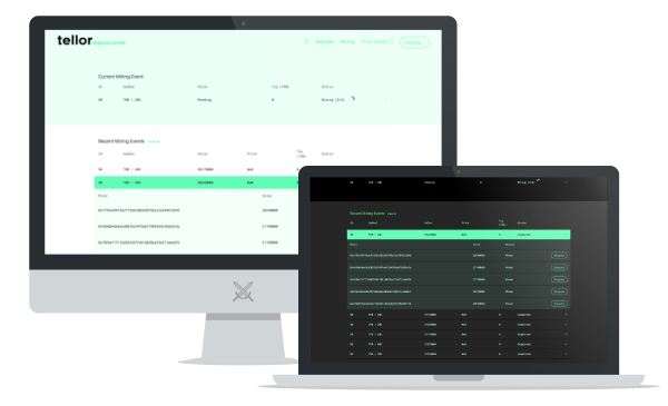
On the design side, we were able to greatly simplify the user experience through a combination of better information architecture and contextual micro-interactions. In the end, we expanded the Tellor visual language into a micro design system that works in light and dark mode, including a new custom loading animation to match.
Activities
UX AuditCode ReviewUI DesignFrontend DevelopmentBackend DevelopmentDeliverables
2 Web3 Apps (Dispute Center, Price Feed)Micro Style GuideResults
We delivered two Web3 applications. One for their Dispute Center and another for the Price Feed.
Client Testimonial
"RaidGuild has been an amazing experience from start to finish, great guys in an awesome DAO and I'd highly recommend them for whatever the project"
- The Mandalore, Tellor.io 